Salt Works Property
The client
Salt Works Property is a property development business specialising in turning old buildings with unique and historical elements such as exposed beams and exposed brickwork, into homes & retails spaces that look modern with a classic touch.
THE PROJECT
Small Business Package: Brand Design Intensive + Foundation Web Design & Development on Wix
BEHIND THE BRAND
When Michelle from Salt Works Property initially approached us, she expressed her desire for a brand that would seamlessly blend old and new, and for a website that would be easy to use and manage, given her busy and on-the-go schedule.
To achieve the perfect balance of heritage and modern elegance, we knew that we had to carefully consider every aspect of the brand. We curated a color palette that would perfectly balance British heritage tones with Victorian hues and weave it with modern tones, creating an authentic and traditional feel that would still have a modern twist. By doing so, we were able to create a brand that exudes sophistication and elegance, with a touch of creativity and flair.
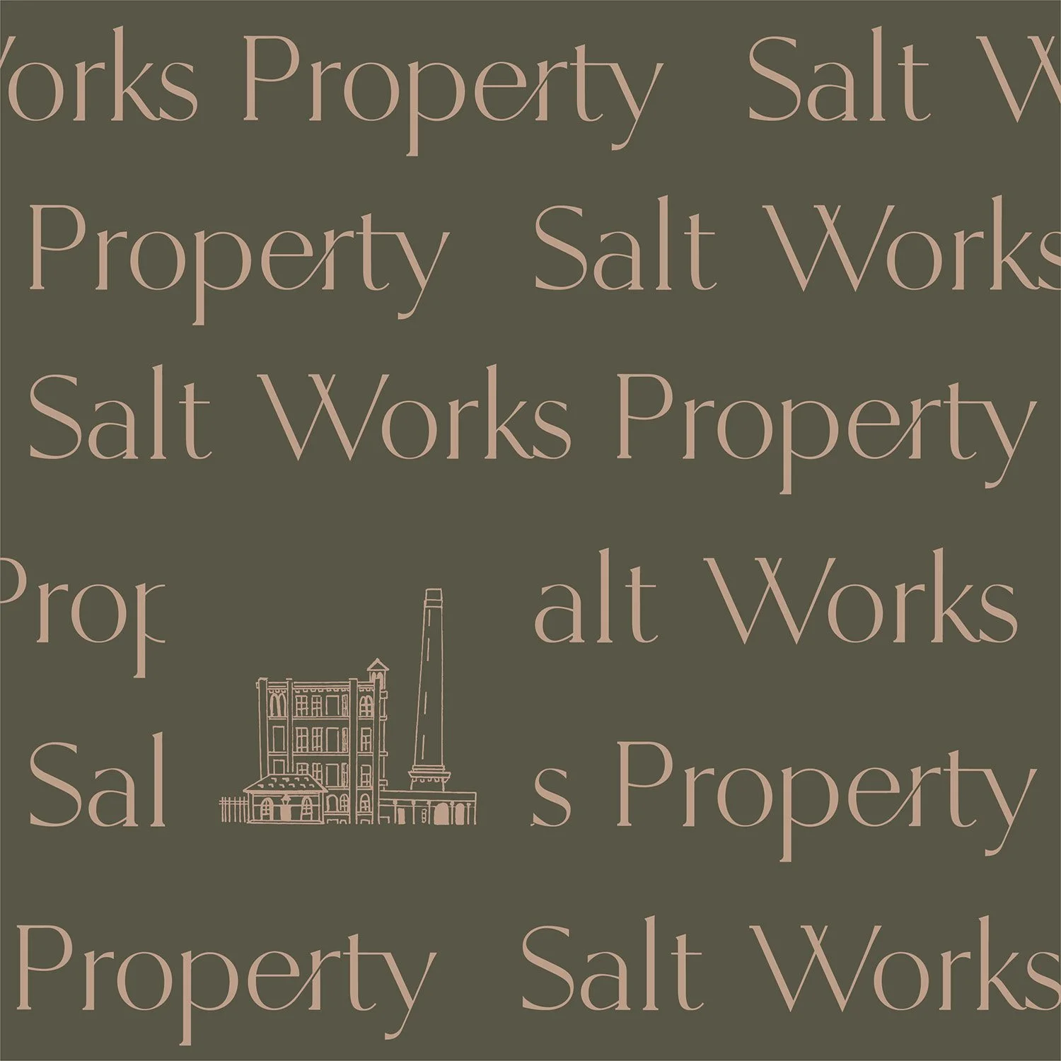
To further enhance an authoritative and professional tone of the brand, we selected a modern Serif font for the typography, which exudes both professionalism and elegance. In addition, we incorporated a few feminine touches with the use of ligatures and flow. These small details may seem minor, but they can make a big difference in the overall feel of the brand.
BRAND TONE
Heritage, Authentic, Quality, Professional, Creative, Elegant.
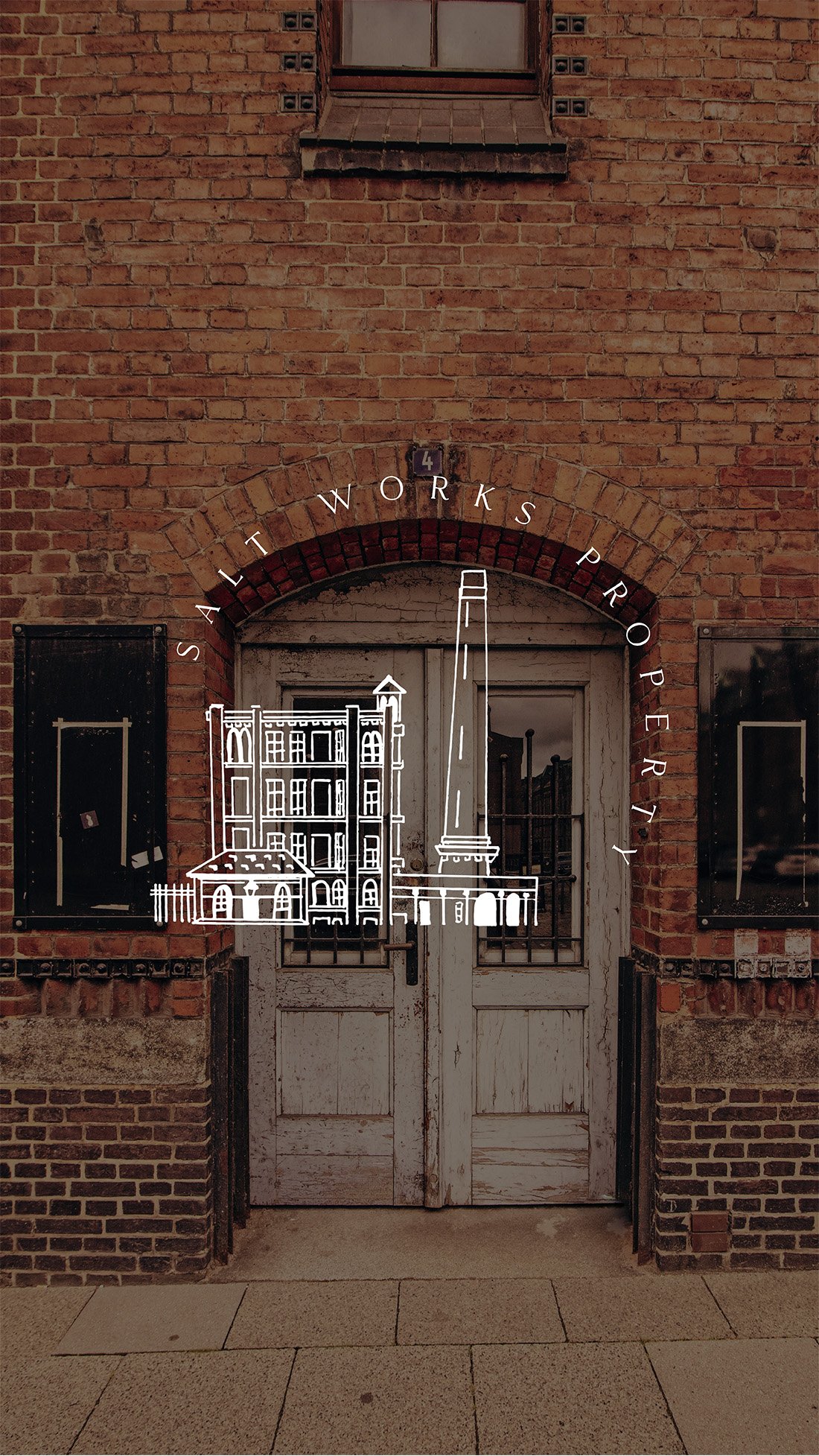
The branding illustration was also a key element in creating a brand that was both authentic and unique. We chose to depict the iconic Salts Mill in Saltaire, which was the inspiration behind her business and the name 'Salt Works Property.' By doing so, we were able to create a brand that not only reflects the heritage and elegance of the market but also the personal story of the business, adding a personal touch that sets her apart from the competition.
Overall, the brand embodies her brand words and provides her with a unique identity that helps her stand out in a male-dominated market.
BUILDING A DIGITAL WORLD
For the website, we aimed to create a customer journey that highlights Michelle's background, unique approach to property development, and qualities. Michelle chose Wix as her platform because of its user-friendliness, ease of management, and minimal coding. Her goal was for the site to serve as her virtual business card, showcasing her background, qualifications, process, and portfolio while maintaining a cohesive brand and tone.
Additionally, we ensured that the website is mobile-optimized, giving Michelle the flexibility and convenience she needs to manage her business while on-the-go.
Kind Words
“I now feel I can go confidently to other professionals in my field armed with my new branding and introduce myself with not only authenticity but professionalism.”
I felt that I was in great hands professionally speaking with Shenny from the start to the end of our working together. She was responsive, and clear with my expectations which I always find reassuring in helping to grow client/ service provider confidence. I would definitely like to work with her again because I experienced a high level of reliability and calmness too. Especially in her explanation of the process , again very reassuring. More to the point the quality of the new design and presentation of my brand impressed me ! I feel that she has embodied the new companies essence supporting my positioning in my niche market place. I now feel I can go confidently to other professionals in my field armed with my new branding and introduce myself with not only authenticity but professionalism. Thanks Shenny!


