
Rivering Roots
The client
Rivering Roots is a home goods store with a purpose. They believe in the power of craftsmanship and artisanal work, and strive to source handmade goods from artisans all over the globe without exploiting their resources or the cultures they come from.
Their goal is to bring a sense of connection to you, your home, and the planet through beautifully unique artisan-made wares.
THE PROJECT
Signature Branding: Brand Strategy + Full Brand Identity
Web Design + Development on Wordpress
Full Packaging Design + Print
Social Media style guide + templates


BEHIND THE BRAND
Rivering Roots draws its main inspiration from nature and balance. Using deep, wholesome tones, flowing textures, and raw, organic forms, their brand identity captures the juxtaposition between rough textures that call forth elements of nature and minimal structures that represent finesse and simplicity. This brand tone is evident throughout their branding, imagery, packaging, and web design.
One of the key elements in Rivering Roots' design is their brand icon. This illustration represents the Earth in a topographical format, as well as a close-up of a fingerprint. The icon highlights our connection with the Earth and nature, and represents the brand's most valued ethos: slow, intentional living and promoting an eco-conscious lifestyle.

BRAND TONE
Grounded, Balanced, Timeless, Organic, Quality, Intentional, Mindful, Purposeful.


The story behind Rivering Roots was sparked by the founder, Kaitlyn Gosse - an avid traveler who has a deep affinity and connection with the earth, she’d come to love the places that combine water (rivers) and earth (roots)—gravitating towards the juxtaposition of these elements in the sense that they complement each other—a balance. Rivering Roots is a place to shop that unites the two highlighting their harmony and the importance of protecting what is around us. They achieve this through carefully curated pieces from artisans around the globe that keep our environment at the forefront of standards—taking care of your home and the planet.


CREATING AN UNBOXING EXPERIENCE
In line with the brand's ethos, we aimed to create a purposeful and mindful experience around their product. We wanted to create an experience that went beyond a simple transactional exchange.
All of their packaging materials are eco-friendly, either recyclable or reusable.
Inspired by nature, the packaging features various textures and forms, such as the rough, hand-drawn curves and lines that represent topographical lines and fingerprints, as well as utilising Kraft recyclable boxes, eco-mailers, eco-friendly stickers, and wrapping. The entire unboxing experience fosters an intentional mindset, encouraging the audience to appreciate the act of unboxing itself and promoting purposeful and deliberate purchases that prioritize value over mass consumerism.


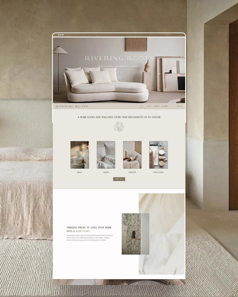
BUILDING A DIGITAL WORLD
Rivering Roots' website, built on Wordpress, conveys the brand's message through its minimal, intentional, and organic design.
Keeping the user journey in mind and utilizing conversion techniques, the site's main goal is to create a mindful and intentional purchasing experience with a focus on eco-consciousness. Inspirations and textures representing nature are integrated throughout the site, including rough, hand-drawn illustrations that tie in with the brand marks and express the brand's vision and identity.


Kind Words
“WHAT I LOVE ABOUT SHENNY IS THAT NONE OF HER BRANDS AND DESIGNS LOOK THE SAME. IT’S NOT COOKIE-CUTTER, IT’S TOTALLY CUSTOM. SHE DOESN’T THROW ONE STRATEGY AT EVERYBODY. IT’S SPECIFICALLY BUILT FOR YOU.”
I wanted a brand that was very authentic and close to the things I hold dear to my heart like the environment, nature, and all things organic, and I was searching for a brand designer who could help me build that dream. I was drawn to Shenny because I loved her aesthetic. I love how clean and crisp her designs are, and how she also throws in that punch of character and a little bit of edge. Shenny was also a joy to work with. She was extremely patient and went back and forth with me a ton of times. She really took the time to get it right!!
She’s not there to slap together a website and call it done. She’s there to make a brand that feels like you. She is a visionary! She can take words from your mouth that don’t make sense and put it into a beautiful design. I’d been thinking for so long about what I wanted my brand to look like, but I couldn’t articulate it. Shenny came in like HERE IT IS! She has been a godsend! I’m so in love with everything she’s done for me!!!
Ready for your turn ?
|
Ready for your turn ? |
View More


